During the past 2 years many crypto index funds emerged as a result of the increased interest in the crypto market. These products offer to their investors a basket of cryptocurrencies under the promise of higher risk-adjusted returns due to portfolio diversification.
In this research article we show how this is actually far from the truth. We find in fact that cryptocurrencies are highly correlated, offering no portfolio diversification benefit by investing in a basket of them. In particular, we find that the performance of Bitcoin and an equal weighted or notional weighted crypto basket portfolio is essentially the same during the analyzed period. Therefore, investors looking for an actively managed product in the crypto space should look at other options, such as a systematic crypto investment program.
A Crypto Index Fund is a product that provides investors an exposure to a basket of cryptocurrencies. The typical methods used to weight the basket constituents are the following:
The main benefits that could potentially be achieved in a basket of cryptocurrencies is portfolio diversification if the constituents are uncorrelated. On the other hand, an investor usually has to pay higher costs compared to a direct investment in cryptocurrencies. These expenses include transaction costs to rebalance periodically and management and sometimes performance fees to the sponsor of the crypto fund index.
In the next section we see if it is worth paying these higher costs analyzing the correlation in the major cryptocurrencies constituents of such portfolios.
Usually proponents of crypto index funds cite portfolio diversification as the main factor in considering an investment in their product. Based on Modern Portfolio Theory, an investor can achieve benefits from portfolio diversification if he invests in a basket of uncorrelated or inversely correlated products.
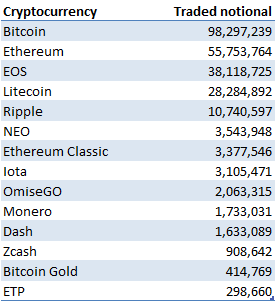
In this analysis we consider the top 14 cryptocurrencies by traded notional on Bitfinex as of April 13, 2019. The period covered goes from March 2013 to April 2019.
Table 1 shows the top 14 cryptocurrencies by traded notional considered in this analysis.
Figure 1 shows the average rolling correlation among the considered cryptocurrencies. As it can be seen from it, cryptocurrencies are highly correlated, with an average correlation of 0.7 as of April 2019. This poses in question the potential benefit that can be achieved through portfolio diversification by investing in a basket of cryptocurrencies through a crypto index fund.
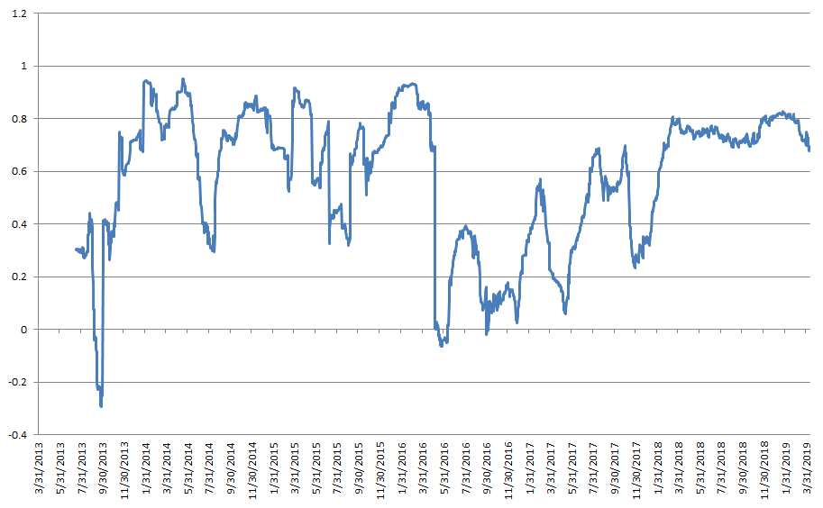
The next section will analyze if this is true by comparing the performance of one cryptocurrency, Bitcoin, to a crypto basket and see if they are similar.
Figure 2 shows on a log scale the hypothetical performance of 2 crypto index funds, equal weighted and notional weighted, compared to a passive investment in Bitcoin. The figures for the crypto funds are gross of transaction costs and fees charged by the sponsor. The performance of the crypto fund indices will be actually lower after considering them. As the figure shows, the performances of the 3 portfolios are very similar.
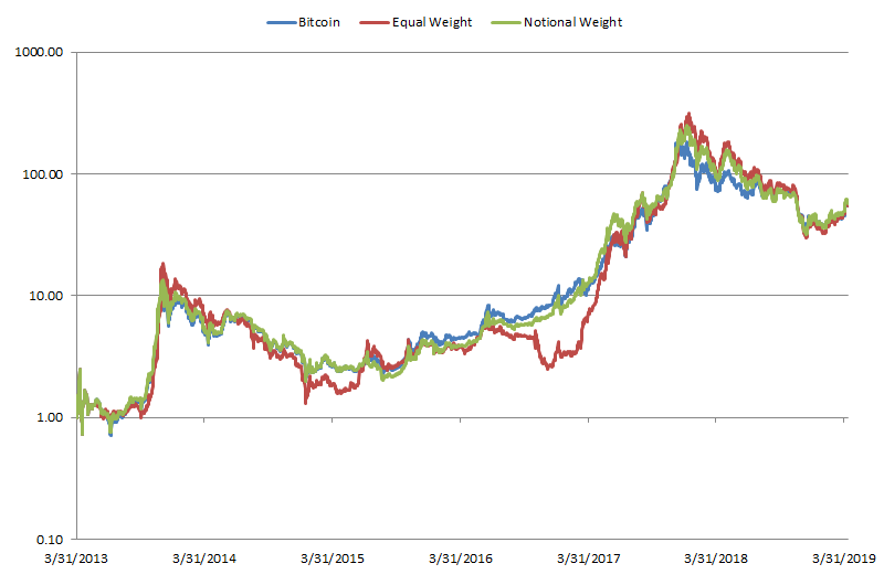
Table 2 shows the performance stats of the 3 portfolios to compare them in a more rigorous way. As the Table show, they all have similar levels of returns, volatility, and Sharpe ratio accordingly.
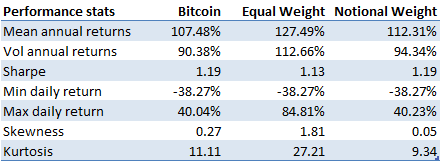
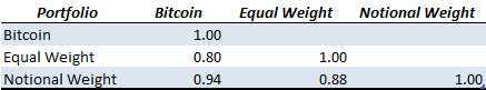
Table 3 displays the correlation matrix between the 3 portfolios. As we would have expected from our previous correlation analysis on cryptocurrencies, the 3 portfolios are highly correlated (ρ = 0.9), posing in serious doubt the validity of an investment into crypto index funds.
As we have seen from the previous data, crypto index funds cannot provide any benefit compared to a passive investment in Bitcoin. Therefore, an investor looking for an actively managed product in the crypto space should consider other options. An example is a systematic crypto hedge fund, which could potentially deliver alpha and an uncorrelated performance compared to Bitcoin and other cryptocurrencies in both bull and bear market conditions.
From our analysis we can deduct the following key takeaways:
This research article analyzes the performance of a systematic global macro investment strategy investing in multiple in publicly traded securities across the world. The strategy invests in all asset classes, including Equity, Fixed Income, Commodity, Currencies, and Volatility. The strategy performance is compared to a traditional equity portfolio, represented by the S&P 500, and to a 60/40 portfolio invested in both equities and bonds.
The article is structured as follows. The first section analyzes the performance of equities as represented by the S&P 500. The second section analyzes the performance of a 60/40 portfolio, frequently used as a benchmark for institutional investors. The third section compares the performance of a hypothetical systematic global macro trading strategy compared to a passive investment in the equity market or a 60/40 portfolio. The fourth section concludes with key takeaways.
Figure 1 shows the performance of the S&P 500 from January 1950 until December 2018 on a log scale.
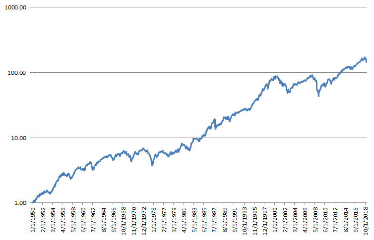
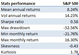
Figure 2 shows the drawdown for a long-term buy and hold strategy in the S&P 500, while Table 1 shows its drawdown statistics.
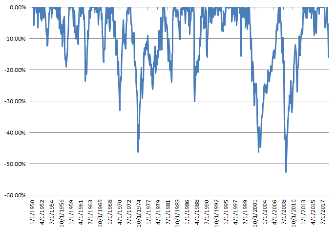
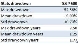
As it can be seen from them, a buy-and-hold investment in the S&P 500 experienced significant drawdowns, with a max drawdown of 52.56%. Some drawdowns were also quite long to recover, with the max drawdown with a length of 7.5 years. This data shows that while it is true that most of the time the equity market goes up, it is also important to try to avoid investing all the money in the stock market since it could take a long time before the investor can recover his losses.
Figure 3 shows the distribution of monthly returns for the S&P 500.
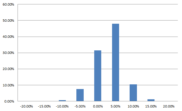
Table 2 shows the performance statistics of a buy-and-hold investment in Bitcoin during the considered period.
As it can be seen from it, the US equity market provided an average annual return of 8.24% during the period, with a volatility of 14.23%, leading to a Sharpe ratio of 0.58. Also, the return distribution is negatively skewed, due to the presence of small positive returns and large and fast negative returns when a recession or market crash happens.
In summary, investing in the stock market require an investor to have a long-term horizon of at least 5 years, due to the presence of long and big drawdowns. The next section will analyze whether it is possible to improve the performance of a passive equity-only investment by adding bonds to the portfolio.
Figure 4 shows the performance of a static buy-and-hold 60/40 portfolio (60/40) from October 2007 to December 2018. The portfolio invests 60% in the equity market, as represented by the S&P 500 (SPY), and 40% in the bond market, as represented by the Barclays Aggregate Bond Index (AGG). This portfolio is typically held by institutional investors and usually considered a diversified portfolio and used as a benchmark.
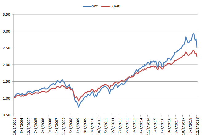
Figure 5 shows the drawdown for a long-term buy and hold strategy in the S&P 500, while Table 3 shows its drawdown statistics.
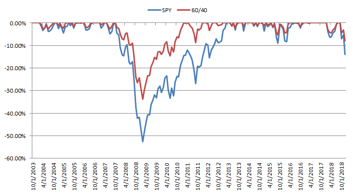
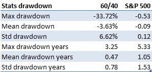
As it can be seen from them, a buy-and-hold investment in the 60/40 ha better drawdowns than the S&P 500, with a max drawdown of 33.72% compared to 52.56% for the S&P 500. The drawdown length also improves, going from a max drawdown of 5.3 year to 3.25, a reduction of around 40%.
Figure 6 shows the distribution of monthly returns for the 60/40 portfolio.
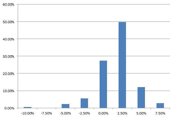
Table 4 shows the performance statistics of a passive buy-and-hold investment in the 60/40 portfolio during the considered period, compared to the S&P 500.
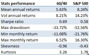
As it can be seen from it, a 60/40 portfolio delivers less return compared to the US equity market, but at the same time is less risky. This delivers in the end a slightly higher Sharpe ratio of 0.69, improving the return per unit of risk taken. This results stems mainly due to portfolio diversification by investing in an uncorrelated asset. In fact, the average correlation between the equity and bond market during the analyzed period is 0.01, indicating that they are uncorrelated. This improves the efficient frontier and provides a better risk-adjusted performance compared a pure equity investment.
In summary, investing in a 60/40 portfolio reduces drawdown width and length and improves the Sharpe ratio, at the expense of less mean annual returns. The next section compares the performance of a 60/40 portfolio and the equity market to an active quantitative global macro investment strategy, to see it the expected performance can be improved.
Figure 7 shows the backtested performance net of transaction costs of a systematic global macro investment strategy from October 2007 to December 2018. The strategy invests in publicly traded securities globally across all asset classes, including Equity, Fixed Income, Commodities, Currencies, and Volatility. The strategy has a fixed target volatility of 15% in order to have risk comparable to an equity market investment as represented by the S&P 500.
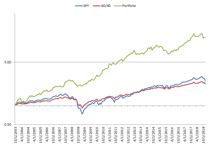
Figure 8 shows the drawdown for the systematic global macro investment strategy compared to the S&P 500 and the 60/40 portfolio.
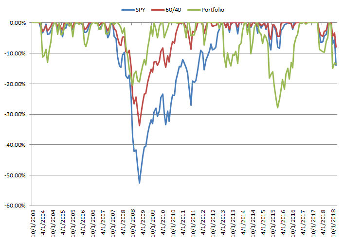
Table 5 shows the drawdown statistics for the 3 investment portfolios. As it can be seen from it and from Figure 8, the portfolio has much lower and faster to recover drawdowns. The max drawdown is in fact 27.79%, almost half compared to 52.56% for the S&P 500. The drawdowns are also faster to recover both on the max and mean measures. The max drawdown length is in fact 2.16 years, compared to 3.25 years for the 60/40 portfolio and 5.3 years for the S&P 500.
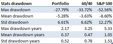
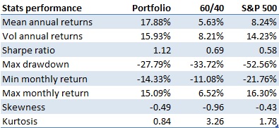
Table 6 shows the performance measures for the 3 strategies. As the table shows, the systematic global macro strategy outperforms both a passive equity market investment and the 60/40 portfolio on both the return and per amount of risk taken. On the return side, it achieves an annual average return of 17.88%, more than double both the S&P 500 at 8.24% and triple the 60/40 portfolio at 5.63%. On the risk side, it has around the same amount of volatility of the equity market per construction. As a result of the better return delivered with around the same amount of risk, the strategy achieves a much better Sharpe ratio of 1.12, compared to 0.58 for the equity market and 0.69 for the 60/40 portfolio. As previously indicated, the max drawdown is also much less and faster to recover.
In conclusion, based on the previous results, even after transaction costs the systematic global macro investment strategy proves to be superior both on return and on a per unit of risk basis compared to a passive long-term investment in the S&P 500 and a 60/40 portfolio.
The previous results highlight the following key takeaways: