By Andrea Leccese
April 14th, 2019
Many companies in 2017 and 2018 decided to raise capital through an Initial Coin Offering (ICO). While the process seemed very promising at the beginning, it also showed its limitations around the end of 2018. In fact, many ICO’s were in fact scams, while other failed to deliver the promises towards their investors. In this research paper we analyze the ICO market from 2015 until present. The first section gives an overview of the ICO market. The second section analyzes more in detail the evolution of the ICO capital raising process over time, while the third section analyzes the main factors driving the ICO capital raise. The fourth section concludes with key takeaways.
ICO Market Stats
For this research we used the info on around 3500 ICO’s completed between September 2015 and March 2019. During this period, ICO’s companies raised a total of around $24 billion, with an average of $15.5 million per ICO. Table 1 shows the top 20 ICO’s by amount of capital raised.
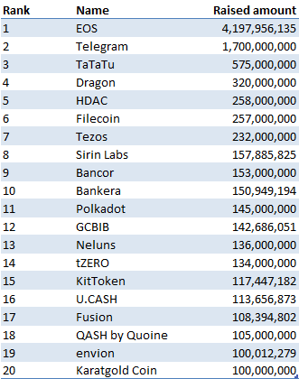
Figure 1 shows the top 20 countries where those ICO’s companies are domiciled. It is interesting to note that despite tighter security laws and scrutiny from the SEC, the United States comes first, followed by Singapore and the UK.
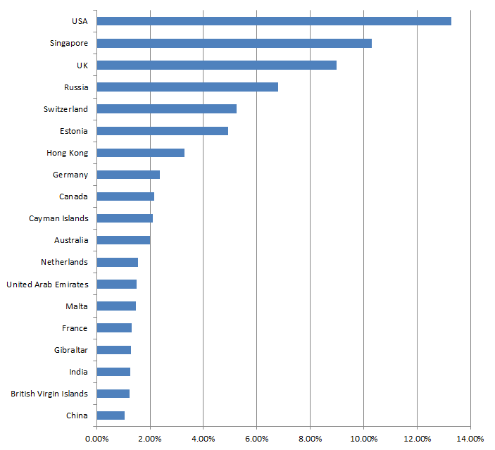
Figure 2 shows the category distribution of the analyzed ICO’s projects. Platform ICO’s come first, followed by cryptocurrency, business services and investments.
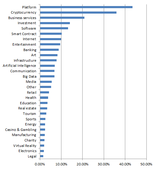
Table 2 shows the type of ICO used. Utility is the great majority at 97%, used mainly initially for regulatory purposes to avoid security laws in many countries. Despite the recent hype in Security Tokens Offerings (STO’s), they only represent about 2% of the total ICO’s so far. We’ll need to see in the coming years if they become the predominant form of ICO type.
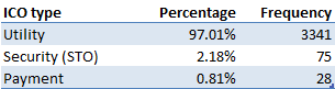
Table 3 shows the status of the completed ICO’s. It is interesting to note that, while many proponents of the ICO model claim liquidity as one main benefit of ICO’s, only around 20% of the completed ICO’s are actually listed for trading on an exchange. This shows that the vast majority of participants in ICO’s were not able to exit their position. This is similar to investing in an offering in a private early-stage company, where exit strategies at the beginning are limited.
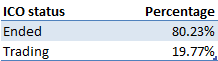
Figure 3 shows the distribution of number of team members for each ICO project. As it can be seen from it, it is a bimodal distribution, with peaks at 1 person and around 8 people.
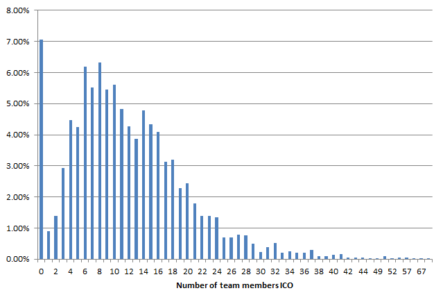
Figure 4 shows the average number of team members over time. As it can be seen from it, there is a steady uptrend in this number, going from around 5 in 2016 to around 15 as of 2019. This possibly indicates greater professionalism and experience in the recent ICO teams compared to the initial ones, and a maturation of the market and its participants.
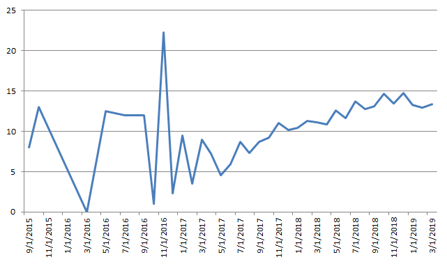
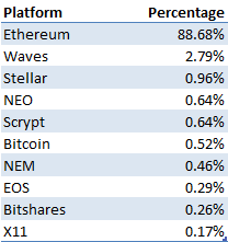
Table 4 shows the top 10 platforms used by the ICO projects to issue their tokens. As it shows, Ethereum is the major one with the ERC20 tokens, constituting around 90% of the tokens issued.
Analysis ICO capital raise over time
This section analyzes the ICO raising process over time from September 2015 to March 2019. Figure 5 shows the number of ICO’s vs the price of Bitcoin during the period analyzed. As it can be seen from it, the number of launched ICO’s is highly correlated to the price of Bitcoin. This makes sense, since it is the price increase in Bitcoin during the considered period that gave rise to the popularity of cryptocurrencies and draw more capital in the ICO market.
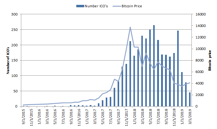
Figure 6 shows the total capital raised for each month compared to the price of Bitcoin. A similar conclusion to what previously discussed applies. In fact, the total amount raised is greatly correlated to the price of Bitcoin.
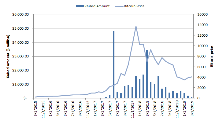
Figure 7 shows the average amount raised per ICO each month on a log scale. As the figure shows and contrary to what it could be expected, the amount has been relatively constant around $15 million since August 2017. This indicates that, despite the decreased interest in the ICO market and slowdown in total amount raised and project launched, successful ICO companies can still expect to raise around the same level of capital as before the bear the market of 2018.
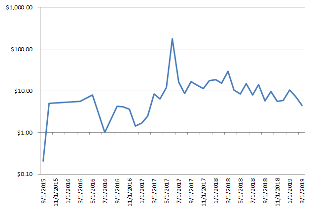
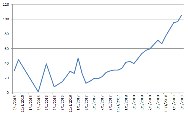
Figure 8 shows the average duration to complete an ICO. As it can be seen from it, there is a steady increase in the average time required to successfully launch an ICO, going from around 30 days in 2017 to around 100 days at present times.
In the next section we will analyze more in depth the relationship between the price of Bitcoin and the capital raised through the ICO process.
Factor analysis ICO capital raise vs Bitcoin price
Figure 9 shows the relationship between the Bitcoin price and the number of ICO’s launched each month for the analyzed period. As it can be seen from it, there is an almost perfect log-log relationship between the 2 variables (R2 = 0.92). This means that one of the main factor impacting the number of new launches in the ICO market is the price of Bitcoin.
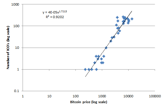
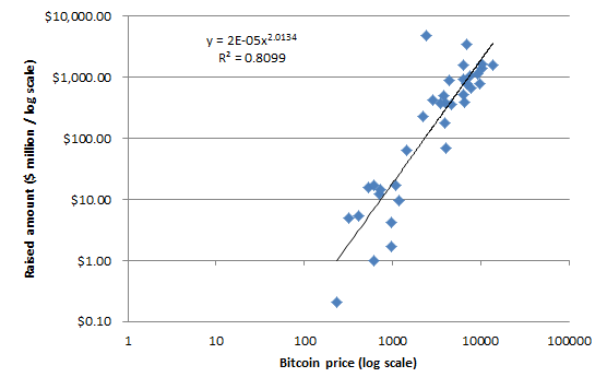
Figure 10 shows the relationship between the Bitcoin price and the total amount raised each month. Similarly to the number of launches, there is a strong log-log relationship between the 2 variables (R2 = 0.81). This makes sense, since many investors remember the losses they had in the bear market and are not willing to invest in new projects because of that. Also, an increase in price of Bitcoin drives more interest in the market, and more capital to invest as a consequence.
Conclusion
The previous results highlight the following key takeaways:
- ICO’s capital raises are highly correlated to the price of Bitcoin: both the number and monthly amount of capital raised in ICO’s are correlated to the price of Bitcoin. Assuming that ICO’s will be used again in the future to fund companies and projects, we will need to wait for another bull market in Bitcoin and cryptocurrencies,
- ICO market is becoming more mature: the average number of people in ICO teams has had a steady increase, signaling more experienced and mature teams getting in the space.
- Valid projects can still raise capital through an ICO, but the process takes longer: the average amount raised per ICO has not changed significantly since 2017, but there has been a steady increase in the average duration of an ICO capital raise, which is around 100 days as of March 2019.
Subscribe to our newsletter to receive our latest insights in quantitative investment management. For more info about our investment products, send us an email at info@blueskycapitalmanagement.com or fill out our info request form.